
For about two years after we moved in, our primary bedroom was the blandest possible shade of builder beige. You know the one that warm nothing-color that’s technically inoffensive but also makes you feel like you’re sleeping inside a manila envelope. I kept telling myself we’d repaint “eventually,” and eventually kept not happening.
Then last fall I finally caved and picked a deep, dark color for the walls. I was terrified. Mark thought I’d lost my mind. Even the woman at the Sherwin-Williams counter raised an eyebrow when I handed her the chip. But after living with it for over a year now, it’s the best decorating decision I’ve made in this whole house. If you’ve been circling these dramatic bedroom color ideas and talking yourself out of them, here’s what I’ve actually learned including where I went wrong and what I’d do differently.
1. Deep Charcoal: The Dark Color That Somehow Reads as Neutral
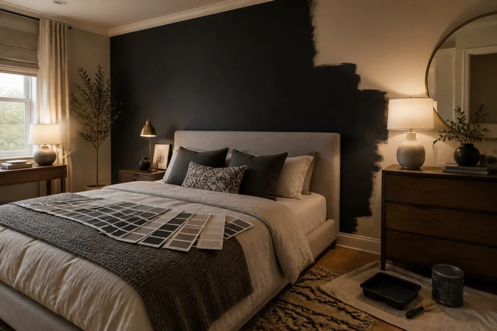
This is what we ended up going with, and it’s still my top recommendation. We used Sherwin-Williams Peppercorn (SW 7674) on all four walls, including the ceiling. Yes, the ceiling. That second part is what makes it feel intentional rather than just dark.
The thing about a deep charcoal is that it acts almost like a neutral it doesn’t fight with your existing furniture the way a bold navy or forest green might. Our bedroom has a mix of warm wood tones and some cool gray upholstery, and Peppercorn sits comfortably with both. At 6 a.m. when the room is lit only by the bedside lamp, it feels genuinely cozy and cave-like in the best possible way. By noon when sun hits the south-facing window, it shifts to something closer to a warm steel gray.
The one thing that went wrong: I underestimated how many coats we’d need to cover that beige. Went back to Home Depot for a second gallon, which I hadn’t budgeted for. Plan on two full coats minimum probably three if you’re going from a lighter color. At around $70–75 per gallon for a premium interior paint, factor that in before you start.
Budget alternative: Behr’s Cracked Pepper from Home Depot runs about $40–45 per gallon in their Premium Plus line. It’s in the same charcoal family and is perfectly respectable.
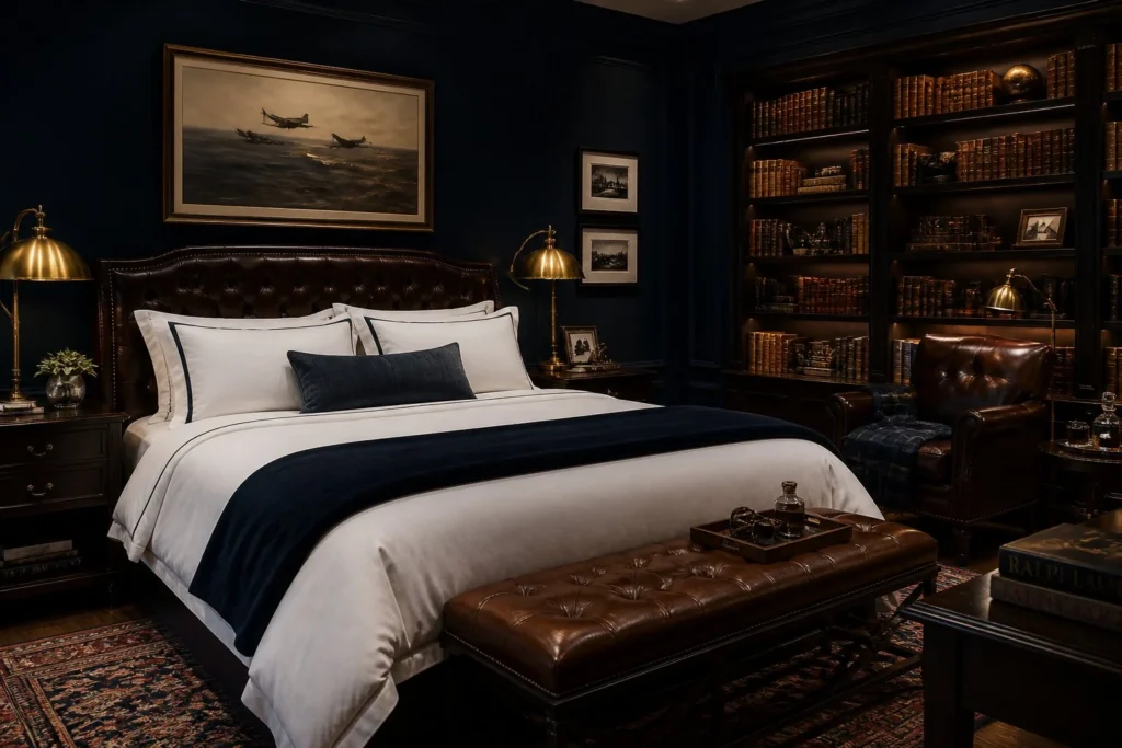
2. Inky Navy: Moody Without Feeling Cave-Like
Navy has been a go-to bedroom color idea for a while now, but the version that’s trending in 2025 is darker and more saturated than the coastal-preppy navy of five years ago. Think less “sailboat wallpaper” and more “gentleman’s library.”
Benjamin Moore Hale Navy (HC-154) remains one of the most consistently popular choices, and for good reason it reads as almost black in low light but opens up to a rich, deep blue when the sun hits it. If you want something even more dramatic, look at Naval by Sherwin-Williams, which is a touch deeper and slightly less purple-leaning than Hale Navy.
Making Navy Work in Smaller Bedrooms
Our bedroom is 10×12, which isn’t huge. When I started researching dark bedroom color ideas for a space this size, most advice said “don’t do it.” Ignore that. The key is keeping your ceiling paint lighter (bright white works well), making sure you have at least one good overhead light source in addition to table lamps, and not crowding the walls with too much furniture or art. A dark room that’s sparse actually feels larger than a beige room packed with stuff.
Budget alternative: Valspar Signature in Dark Kettle Black has a navy base that shifts beautifully in different lights and comes in under $40 at Lowe’s.
3. Forest Green: The Dark Color People Underestimate
Forest green is having a real moment, and unlike a lot of trends I’ve chased and regretted (I’m looking at you, open wire shelving), this one has actual staying power. A true deep forest or hunter green not sage, not mint, but dark gives a bedroom a grounded, almost organic quality. It feels like the walls are doing something for you rather than just existing.
Sherwin-Williams Hunt Club (SW 6468) is one I’ve seen show up in bedroom after bedroom on design sites for the past two years, and it photographs beautifully. For something even darker, Benjamin Moore Black Forest Green is as saturated as you can get before a color starts reading as black.
The caveat here: forest green is less forgiving with undertones than charcoal or navy. In our Charlotte summers when we keep the blinds shut against the heat, a green wall can pick up a yellow-brown cast from incandescent bulbs. Make sure you’re testing your chip in the room at different times of day, including evening with your actual lamp bulbs. A green that looks rich and grounded in the afternoon can look swampy by 9 p.m. in warm lamplight.
Budget alternative: Rust-Oleum makes a chalked paint in a deep forest tone at around $14 a quart not ideal for full walls, but great for an accent piece or furniture moment to test the color family before committing.

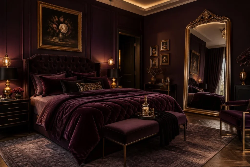
4. Plum and Aubergine: The One People Are Scared Of
This is the bedroom color idea with the highest ceiling and the highest floor for mistakes. When it’s wrong, it’s very wrong. When it’s right, it’s the most luxurious-feeling bedroom you’ve ever slept in.
The key is going dark enough. A mid-toned plum or dusty mauve reads as a leftover nod to the 1990s. You want to go deep Benjamin Moore Blackberry Wine or something in the eggplant range. At that depth, the color stops reading as “purple” and starts reading as a sophisticated dark neutral with warmth to it.
I haven’t done this one in our bedroom (Mark drew the line at plum we compromised on charcoal), but I spent a while researching it seriously. The primary risk is that aubergine can make a room feel smaller and lower-ceilinged if you also have a lot of dark furniture. If your bed frame and dressers are mid-tone wood or white, you’ll have more success. Keep at least one wall element light a large mirror, white bedding, or natural linen drapes.
Budget alternative: World Market occasionally carries peel-and-stick wallpaper in deep jewel tones around $35–50 per roll if you want to test an aubergine accent wall without the paint commitment.
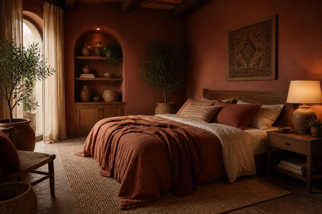
5. Deep Terracotta: The Warm Dark That’s Not Red
This one surprised me when I started researching it. Terracotta has been in the conversation for a few years as an earthy, warm neutral but the dark version, a deep rust-meets-clay tone, reads completely differently than the lighter, more orange terracotta people associate with Southwestern decor.
Think of something like Sherwin-Williams Cavern Clay (SW 7701) pushed three shades darker, or Benjamin Moore Moroccan Spice. At this depth, terracotta becomes cozy and enveloping rather than bright and ethnic-pattern-adjacent. It works especially well on a single accent wall behind the bed paired with warm-white walls on the other three sides.
One warning I’d give from my research: terracotta tones are particularly sensitive to the light color temperature in your room. I’ve seen it look incredible in photos with warm 2700K bulbs and look like a safety cone with cooler daylight-spectrum lighting. If you’re going this direction, pair it with warm-toned bulbs (2700K or 3000K max) and you’ll be much happier. Swapping out your bulbs costs almost nothing a pack of warm LED bulbs at Target runs about $8–12 and it makes a bigger difference than most people expect.
Budget alternative: Try a deep terracotta at HomeGoods or T.J. Maxx in throw pillows and bedding first. If the tone makes you happy every morning when you wake up, then paint the wall.
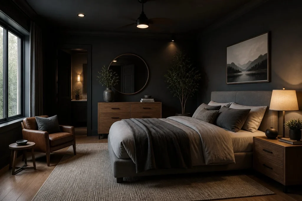
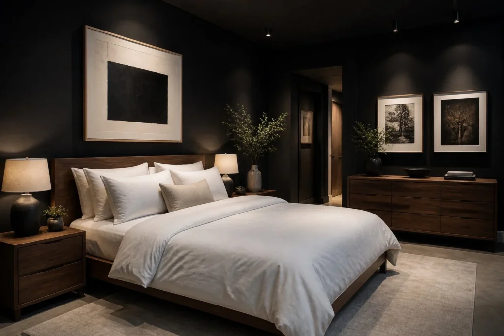
6. Near-Black: For When You Actually Want to Commit
There’s a version of the dark bedroom that skips all the intermediate steps and just goes black or close to it. Off-black paints like Tricorn Black by Sherwin-Williams, Wrought Iron by Benjamin Moore, or Black Magic by Behr have become genuinely popular for bedrooms, especially primaries, over the past couple of years.
What Near-Black Actually Does to a Room
Counterintuitively, near-black walls don’t make a bedroom feel claustrophobic if the rest of the room is handled well. Light bedding white, cream, or soft linen pops brilliantly against a dark wall in a way it never does on beige. Art looks like it’s hanging in a gallery. Warm-toned wood furniture glows. The room feels intentional and finished in a way that lighter colors sometimes don’t achieve.
What you do lose is flexibility. If you later want to go lighter, you’re looking at a primer coat plus two to three coats of the new color, minimum. Near-black is a commitment. I’d suggest living with large peel-and-stick swatches (Samplize sells them for around $5 each) on your wall for a full week before purchasing a full gallon. See it in the morning. See it at night. See it after a long Thursday when you just want to get into bed and feel like the room is hugging you. If it still looks right at the end of that week, you’ve found your color.
Budget alternative: Behr Cracked Pepper or Ultra Pure Black are available in sample quarts at Home Depot for about $5, which is enough to paint a test patch directly on the wall better than peel-and-stick if you want to see the exact sheen.
7. Two-Tone Dark: When You Can’t Commit to All Four Walls
If the idea of four dark walls still makes you nervous, the two-tone approach is a genuinely good middle ground not a cop-out. Paint the bottom two-thirds of your walls in the dark color and carry a lighter tone (or white) above a picture rail or painted chair rail line. Or do just the wall behind your bed the “headboard wall” in the dramatic color and keep everything else light.
The headboard wall approach is actually what I did first before I got brave enough to do all four walls. I painted just the wall behind our bed in Peppercorn, and we lived with that for about four months. It looked great. It just looked like it was asking for more. Eventually the other three walls went dark too, and the room instantly felt more cohesive like the one dark wall had been holding its breath waiting for company.
For the two-tone effect with a chair rail line, try to place the division around 36 inches from the floor, which is roughly where wainscoting traditionally sits. Go any lower and it starts looking like a mistake rather than a choice. Any higher and you’ve basically painted the whole wall anyway.
Budget alternative: This is your built-in budget option one accent wall costs roughly half the paint of four full walls, which can save $70–150 depending on room size and paint brand.
What I’d Do Differently
I’d test more and assume less. My first mistake was thinking I knew how Peppercorn would look based on the chip alone. I was mostly right, but I didn’t account for how the color would shift in our bedroom’s north-facing corner where the overhead light doesn’t reach well. That corner sits a full shade darker than the rest of the room, and while I’ve come around to liking it, it surprised me for the first few weeks.
Second mistake: not removing all the outlet covers and switch plates before painting. I painted around them like a person who had given up on herself. The final result looks almost fine but almost fine is not fine. If you’re committing to a dark, dramatic bedroom color idea, spend the extra twenty minutes pulling every plate, painting a clean edge, and putting them back. The difference is visible and it matters.
Third thing I’d change: I skipped the primer. I told myself a high-quality paint wouldn’t need it. Two and a half gallons of Peppercorn later, the lesson has been learned. Tinted primer ask your paint counter to tint it toward your chosen color saves you a full coat of expensive paint and pays for itself immediately.
